Color theory interior design is the art of using color to enhance the aesthetic and function of a space. At its core, color theory in interior design is the guideline by which we determine the potential of colors to transform a room completely. The right color palette can evoke emotions, alter perceptions, and significantly enhance the overall design of any living space.
For beginners, the concept of color theory can seem overwhelming—what with its color wheels, warm and cool colors, and myriad of rules like the 60-30-10 guideline. But fear not! This article is your ultimate checklist, simplifying interior design color theory essentials so that you can apply them confidently.
In this article, we will explore how to craft harmonious color schemes, the emotional influence of warm and cool colors, and the role of accent colors in adding depth to your décor. Whether you’re reviving a room or starting from scratch, this checklist will equip you to infuse your home with balanced and beautiful colors. Prepare to transform your space—and your design prowess—along the way.
What Is Color Theory?
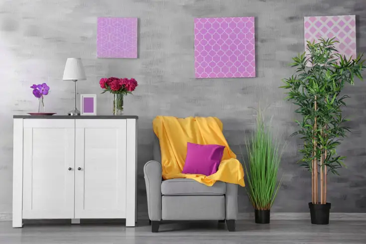
Color theory is like the grammar of the visual design world—it’s a set of guidelines for understanding how colors mix, match, and contrast to create a certain mood or feel in a room. Think of it as the playbook for deciding what colors look good together and why.
In interior design, color theory takes on a crucial role. It helps designers choose colors that can make a small room feel more spacious or a cold, stark room feel warmer and more welcoming. Here’s a quick example: ever noticed how a room with lots of blues and greens feels calm and serene? That’s color theory in action, using cool hues to create a peaceful atmosphere.
So, when you’re looking to give your own space a makeover, a good grasp of color theory can be your best friend. By understanding the basics, like which colors complement each other or how to create a balanced palette, you’ll be well on your way to designing spaces that not only look great but feel just right, too.
Why Is Color Theory Important for Interior Design?
Color theory is vital for interior design because it lays the foundation for creating a cohesive and appealing space. It’s all about the relationship between colors and their impact on a room’s ambiance.
Imagine walking into a room that’s entirely in harsh, bright shades. It might feel overwhelming, right? That’s where color theory steps in. It teaches us that a balanced mix—perhaps using the 60-30-10 rule, where 60% is a dominant color, 30% is a secondary color, and 10% is an accent—can harmonize a space, giving it a pleasing aesthetic.
Moreover, color theory helps tap into the psychological effects of color. Warm colors can make large, empty spaces feel cozier, while cool colors can turn a cramped room into a calming sanctuary. When interior designers talk about color psychology in interior design, they’re referring to using shades to evoke specific emotions or moods.
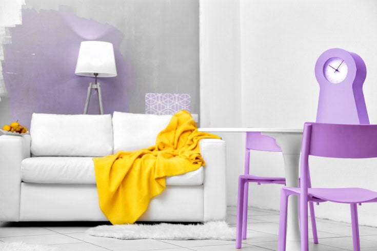
Using color theory for interior design also means you can play with color schemes that ensure your room doesn’t just look good but also functions well. For instance, choosing the right color palette can influence the perceived temperature of a room or even make it seem more spacious.
So, whether it’s selecting the perfect complementary colors for cushions and drapes or picking an accent color for a statement wall, color theory gives you the rules of the game. And once you know the rules, well, that’s when you can get really creative with your interior design projects.
How Can Beginners Grasp the Color Wheel?
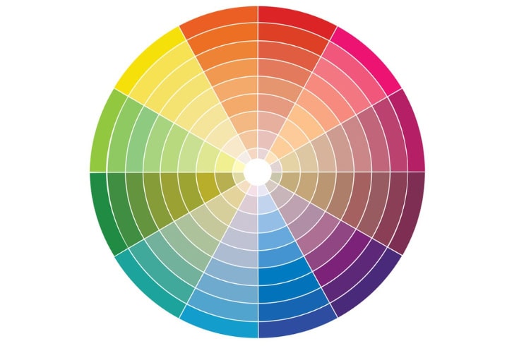
For beginners, the color wheel is like a map to navigate the world of colors. It’s a visual representation of colors arranged according to their chromatic relationship. So, here’s a straightforward step-by-step guide any beginner can follow to understand the color wheel and apply it to interior design:
Start with the Basics
Identify the primary colors on the wheel: red, blue, and yellow. These are the roots from which all other colors are made.
Understand Secondary Colors
Learn how mixing two primary colors creates secondary colors: red and blue make violet, blue and yellow make green, and yellow and red make orange.
Explore Tertiary Colors
Mix a primary color with a neighboring secondary color to discover tertiary colors, like red-orange or blue-violet.
Study Color Relationships

Look at complementary colors, which are opposite each other on the wheel, like red and green. These create contrast and vibrancy when used together. Examine analogous colors, which are next to each other on the wheel, like blue, blue-green, and green. They create harmony and are great for a peaceful design.
Embrace the Tints, Tones, and Shades
Add white to a color for tints, gray for tones, and black for shades. This adds variety and depth to your color schemes.
Practice Creating a Palette
Choose a dominant color for your room. Then, using the color wheel, select a secondary color and an accent color to complement it.
Apply the 60-30-10 Rule
Use 60% of your dominant color in the room, 30% of the secondary color, and 10% of the accent color for a balanced look.
Experiment with Color Schemes

Set up a mock layout using color swatches or a design app to see how your chosen palette would look.
Seek Inspiration
Look at nature, art, or online galleries for color combinations that appeal to you and see how they align with the color wheel principles.
Reflect on the Emotional Impact
Consider the mood you want to evoke. Warm colors can energize a space, while cool colors can calm it down.
By following these steps, even as a beginner in interior design, you’ll be able to grasp the fundamentals of the color wheel and use it to create beautiful, cohesive spaces that reflect your personal style.
What Are the Key Color Schemes in Color Theory?
In color theory, there are several key color schemes that leverage the color wheel to create different aesthetics and moods within interior design. Here’s a look at each:
- Complementary color scheme: This scheme uses colors opposite each other on the color wheel, like blue and orange or yellow and violet. It’s great for creating a dynamic and high-contrast environment.
- Analogous color scheme: Analogous colors sit beside each other on the wheel. Think green, blue-green, and blue. This scheme is often found in nature and is harmonious and soothing, ideal for a calm and restful space.
- Triadic color scheme: A triadic scheme involves three colors evenly spaced around the color wheel, such as red, yellow, and blue. This brings a vibrant and lively energy while maintaining balance.
- Split-complementary color scheme: This scheme, a variation of the complementary scheme, uses a base color plus two adjacent tertiary colors from its complement. For instance, blue with yellow-orange and red-orange. It offers high contrast with less tension than the complementary scheme.
- Tetradic (double-complementary) color scheme: Here, four colors are used, forming a rectangle on the wheel. For example, blue and violet paired with orange and yellow. It’s complex and best used in large spaces or where many colors are needed.
- Monochromatic color scheme: This scheme focuses on a single color, extended through the use of its tints, tones, and shades. A monochromatic room in varying shades of green can create a unified and elegant look.
Each of these color schemes can be employed to achieve different visual and emotional effects in interior design. Whether you’re looking for contrast, harmony, vibrancy, or subtlety, these key color schemes are powerful tools for any interior designer.
How Do Color Relationships Affect Room Dynamics?
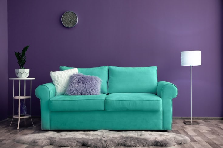
Color relationships dramatically influence room dynamics by altering perception and mood. Complementary colors create energy and contrast, making spaces pop and feel lively. Analogous colors offer a serene and cohesive look, ideal for peaceful, quiet areas.
A monochromatic scheme can make a room feel more spacious and elegant, while analogous schemes bring harmony and tranquility. Using warm colors can make a room feel cozy and inviting, whereas cool colors tend to create a calm, more spacious atmosphere.
What’s the Role of Warm vs. Cool Colors?
Warm and cool colors play distinct roles in interior design by affecting the atmosphere and feeling of a space. Warm colors, like reds, oranges, and yellows, evoke feelings of warmth and comfort, making large, open spaces feel more intimate and cozy. They’re often used in social areas like living rooms and kitchens to create an inviting atmosphere.
On the flip side, cool colors, such as blues, greens, and purples, have a calming effect and are associated with relaxation and tranquility. They can make small rooms appear larger and more open, which is why they’re a popular choice for bedrooms and bathrooms.
What Is the 60-30-10 Rule and How to Use It?
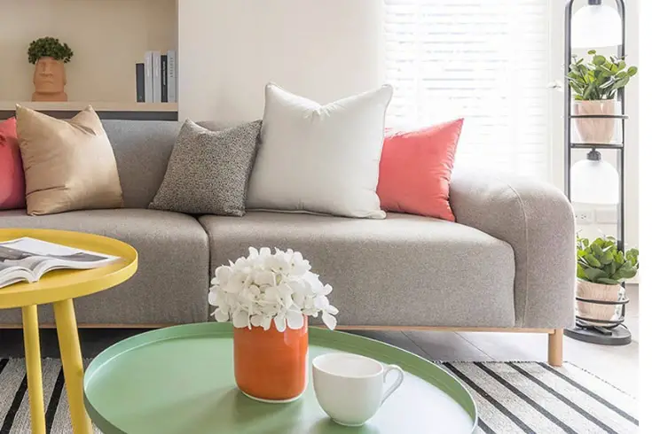
The 60-30-10 Rule is a classic principle in interior design that helps create a balanced color palette in any space. Here’s how it works:
- 60% – dominant color: This is your main color that acts as the backdrop for the room—walls, large accent pieces, and area rugs. It’s often a neutral or muted tone that sets the overall tone of the room.
- 30% – secondary color: This color supports the dominant color and adds depth. It’s used for upholstery, curtains, and smaller furniture. It usually contrasts with the main color to create visual interest.
- 10% – accent color: This is the boldest color in your palette. It’s for decorative accessories, artwork, and accent pieces. This pop of color gives the room personality and ties everything together.
Using this rule, you can achieve a sense of balance and harmony in your room, with each color having its place without overwhelming the space. It’s a straightforward guideline to help even beginners create professionally styled rooms.
How to Choose the Right Accent Colors?
Choosing the right accent colors is all about creating highlights and focal points that draw the eye and add interest to your room. Here’s how to do it:
- Refer to the color wheel: Look for complementary colors to your dominant and secondary hues for a vibrant pop, or select analogous colors for a more subdued accent.
- Consider the mood: Think about the emotional impact you want to make. Vibrant accents can energize a space, while softer accents can maintain a relaxed atmosphere.
- Sample your choices: Test potential accent colors with swatches in your space. Observe how they change in different lighting conditions.
- Start small: Introduce your chosen accent colors in easily changeable items like throw pillows, art pieces, or decorative vases.
- Balance with neutrals: If your accent color is bold, ensure it doesn’t overwhelm by balancing it with neutral tones in the room.
- Be consistent: Distribute your accent color throughout the space to create a sense of unity and flow.
Are There Any Color Theory Tools for Beginners?
Yes, there are several color theory tools designed to help beginners:
- Color wheel: The fundamental tool for understanding color relationships—great for visualizing primary, secondary, and tertiary colors.
- Color palette generators: Online tools that help create color schemes based on the color wheel.
- Color swatches: Physical or digital samples that allow you to compare and contrast colors directly in your space.
- Design software: Programs like Photoshop or interior design apps that let you experiment with colors in a virtual room setup.
- Mobile apps: Handy apps for smartphones and tablets that can identify color schemes from photos and provide color matching.
- Pantone color guides: Manuals showing a wide range of standardized colors for precise color selection and communication.
Using these tools, beginners can more easily decide on color schemes and visualize how they will work in their interior design projects.
Conclusion
Grasping color theory in interior design is essential for crafting spaces that are not only visually appealing but also functionally sound. By understanding the color wheel, recognizing the impact of color relationships on room dynamics, and utilizing tools like the 60-30-10 rule, anyone can enhance the ambiance of their home.
Remember, from choosing the right accent colors to considering the psychological effects of warm versus cool tones, every color choice shapes your space’s experience.
Ready to transform your space with color? Start experimenting today and watch as the principles of color theory interior design bring balance, harmony, and character to your home.


