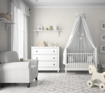
Neutral color scheme interior design represents a world of sophistication and subtlety, using hues like white, beige, and gray to create serene and timeless spaces. This article will guide you through the leading trends in neutral interiors, from choosing the right shades to the interplay of textures and materials that add depth. We’ll reveal how lighting, patterns, and balance can transform a space, and show real-life examples that illustrate the elegance of neutrals.
Dive into the tranquil universe of neutral colors and discover how they can offer a canvas of possibilities for your home. With a focus on the latest design movements and practical tips, get ready to be inspired by the understated charm of a neutral palette.
What Are the Latest Trends in Neutral Color Scheme Interior Design?
Neutral color scheme interior design continues to evolve with fresh trends that offer comfort and style. Here’s a rundown of what’s hottest right now:
Warm Neutrals
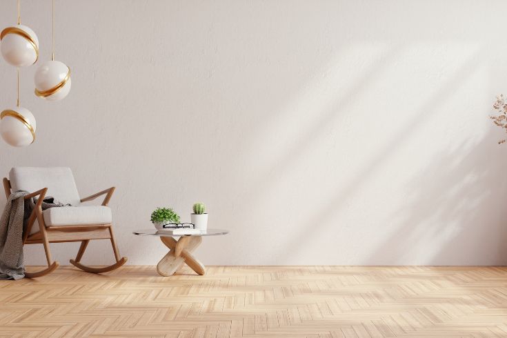
Say goodbye to the stark, cold whites and hello to warm, inviting neutrals. Think creamy off-whites, soft beiges, and cozy taupes that make your living space welcoming. They’re perfect for creating a snug ambiance that’s soothing to the eyes.
Nature-Inspired Hues
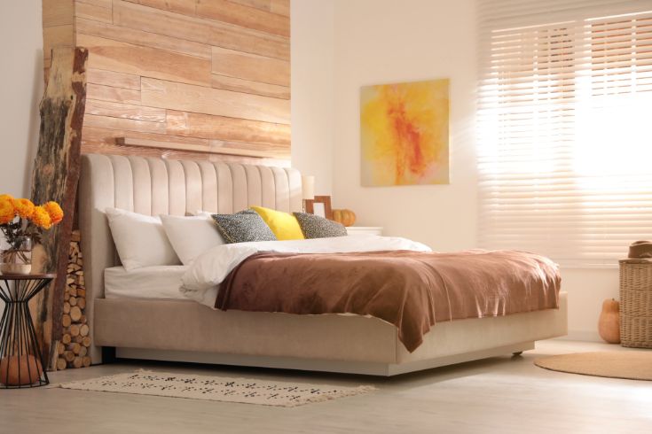
Colors that mimic natural elements are big. Olive greens, sandy browns, and muted blues are being pulled right from the outdoors into our homes. They work wonderfully with a neutral palette, adding gentle pops of color that remain understated yet refreshing.
Layered Textures
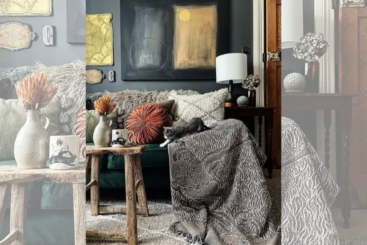
It’s all about the feel! Combining different textures enriches a neutral space. Imagine a chunky knit throw on a smooth leather sofa or linen curtains over a sleek marble window sill. These tactile experiences add depth and interest to the simplicity of a neutral backdrop.
Statement Pieces
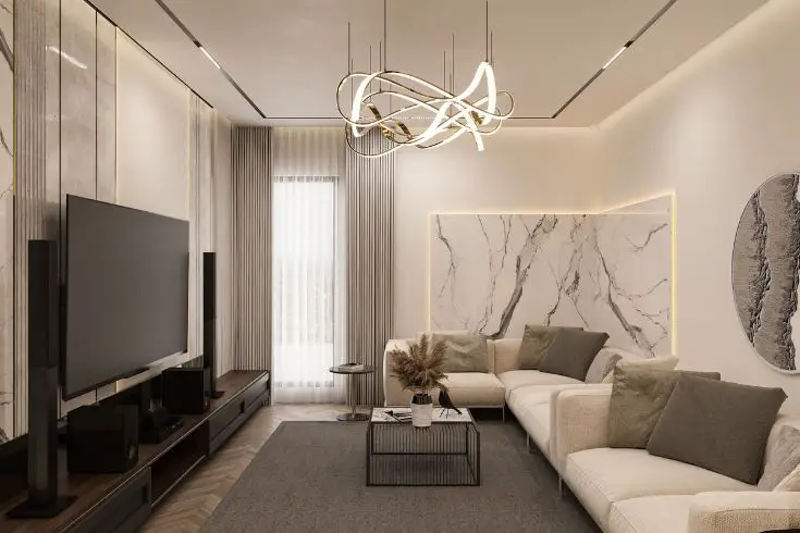
Even in a neutral room, a statement piece can shine. A bold, sculptural lamp or a large piece of abstract art can act as a focal point without disrupting the calming neutral theme. It’s like a dash of spice in a classic recipe—just enough to intrigue.
High Contrast
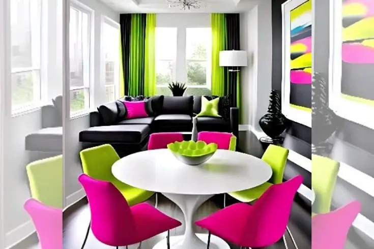
Introducing dark accents in a light neutral room creates visual drama and definition. Think a dark-stained coffee table or jet black picture frames. This contrast is a sophisticated way to add dimension while keeping the neutral theme strong.
Biophilic Design
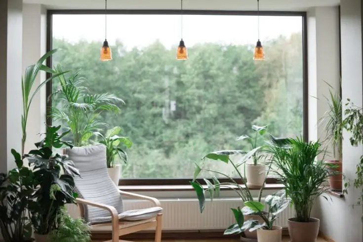
This trend merges nature with design, incorporating elements like plants, natural light, and organic forms into interiors. In neutral spaces, it brings vitality and a sense of growth that’s both comforting and aesthetically pleasing.
Sustainable Materials
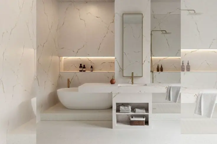
More than just a trend, it’s a movement. Sustainable materials like reclaimed wood, recycled glass, and bamboo are becoming stars in neutral interiors. They add texture and tell a story, all while being kind to our planet.
Each of these trends can make a neutral color scheme vivid and dynamic, proving that neutrals are anything but boring. They offer a canvas where warmth, nature, texture, and sustainability can create a rich tapestry of design that’s both current and timeless.
How Do You Choose the Perfect Neutral Color Palette for Your Home?
Choosing the perfect neutral color palette for your home is like curating a collection of fine art – it’s personal, intentional, and should reflect the essence of your space. Here’s how you can nail it:
- Assess Your Space: Take a good look at your room’s natural light, size, and existing features. Rooms bathed in sunlight can handle cooler neutrals without feeling stark, whereas dimmer spaces benefit from warmer tones to add coziness.
- Consider Your Furnishings: The neutral backdrop should complement what you already have. If your furniture is modern and minimalistic, lean towards crisp whites or soft grays. For more traditional decor, creamier neutrals can add depth.
- Think About Mood: What vibe are you aiming for? Calm and tranquil or sophisticated and urban? Lighter neutrals can open up a space and exude serenity, while deeper shades like charcoal can bring an edgy, modern feel.
- Mix Shades and Tones: Create a layered look by combining different shades of neutrals. Pair a light beige wall with deeper taupe accents in rugs or pillows. It adds complexity without the chaos of color.
- Play with Undertones: Neutrals aren’t just gray or beige; they have undertones that can be warm (yellow, red) or cool (blue, green). Pick the undertone that best fits the seasonal feel you’re after or that complements your home’s architecture.
- Sample Before You Commit: Paint swatches on your wall and observe them throughout the day. The light changes can dramatically affect how the color looks. Live with them for a few days to see what resonates with you.
- Think Long-Term: Neutral colors are timeless, but you should still love them five years down the line. Opt for hues that you have a long-term affinity for, not just because they’re trendy.
By carefully considering these points, you can craft a neutral color palette that doesn’t just look stunning but feels like the true essence of your home.
How Can Textures and Materials Elevate a Neutral Interior?
Textures and materials are the secret spices that can elevate a neutral interior from flat to fabulous. Here’s the scoop on how they work their magic:
- Add Warmth with Wood: A glossy oak floor or a rustic pine table can bring warmth and character to a room dominated by neutral tones. Wood’s natural grain adds a layer of texture that feels both organic and luxurious.
- Mix in Metals: Incorporate metal accents like brass lamps or chrome handles to add a touch of understated glamour. Metals reflect light, offering a subtle shimmer that can make a neutral room gleam with sophistication.
- Layer Fabrics: Pile on different fabrics to give depth to your space. A velvet cushion here, a silk throw there, and a hefty linen curtain can create a tactile experience that invites touch and adds visual interest.
- Play with Patterns: Even within a neutral scheme, patterns can thrive. A geometric rug or a striped accent chair can break up the monotony without straying from your palette. It’s pattern-play without the color chaos.
- Incorporate Stone and Concrete: These materials can introduce an industrial edge or an element of cool elegance. A marble countertop or a polished concrete floor in neutral hues complements the color scheme while making a subtle statement.
- Natural Fibers for a Down-to-Earth Feel: Baskets, jute rugs, or woven wall hangings in their natural, uncolored state bring texture and a casual, laid-back vibe that’s just right for a neutral space.
Through the careful selection of textures and materials, a neutral interior can be transformed into a space with dimension, elegance, and vitality. It’s all about adding layers of interest that engage the senses and keep the eye moving around the room.
What Are the Secrets to Accentuating Interiors with Neutral Colors?
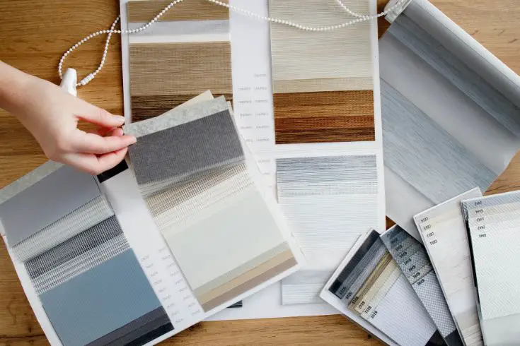
Accentuating interiors with neutral colors is all about creating a space that’s both calming and captivating. Here are a few secrets to nail it:
- Contrast is Key: Use contrasting neutrals, like pairing a light beige wall with dark chocolate furniture, to create visual interest and depth.
- Texture Talks: Incorporate varied textures like a shaggy rug on a smooth floor or fluffy pillows on a sleek sofa. These differences add layers to a room, making it feel rich and inviting.
- Metallic Accents Shine: Sprinkle in some metallic elements — a brass lamp, a silver frame, or a matte gold vase can add a little sparkle and sophistication without overwhelming the space.
- Play with Patterns: Subtle patterns in the same neutral shade as your walls can add dimension. Think patterned wallpaper in a soft gray or ornate pillows in varying shades of cream.
- Focus on the Finish: Mix different finishes to keep things interesting—a matte wall, a satin pillow, and a glossy table can all coexist harmoniously within a neutral scheme.
- Artwork as a Focal Point: A striking piece of monochromatic art can serve as a stunning focal point that draws the eye without disrupting the serene vibe of the room.
- Greenery Adds Life: A pop of green from plants can break up neutrals while still keeping the look streamlined and refreshing.
How Does Lighting Influence the Perception of Neutrals?
Lighting plays a pivotal role in how we perceive neutral colors in interior design, acting almost like a filter that can alter the mood and feel of a space. Neutrals are particularly sensitive to changes in lighting because of their subtle tones. In natural daylight, neutrals often appear brighter and more true to color, giving a room a fresh and airy feel.
As the sun shifts, so do these hues, with warmer light in the morning or evening imparting a cozy, golden glow to creams and beiges. Artificial lighting, on the other hand, can either enhance or distort neutral colors. Soft, warm bulbs can enrich the warmth of neutral tones, making a room feel inviting, while cool white light mimics the midday sun and can make the same space feel more spacious and serene.
With the right lighting, a neutral palette can create an ambiance of understated elegance, displaying a range of subtle variations that might otherwise go unnoticed.
Can Patterns and Prints Complement Neutral Color Schemes?
Absolutely, patterns and prints can be the perfect companions to neutral color schemes in interior design, adding a dash of dynamism without overwhelming the space. Think of a soft grey room with a chevron-printed throw blanket or a beige living space adorned with subtle striped cushions.
These patterns can introduce movement and interest to the eye while staying within the soothing palette of neutrals. Wallpaper with a delicate botanical print in muted tones can turn a plain wall into a statement without straying from a neutral aesthetic. In a room decked in neutrals, a rug with a geometric pattern can anchor the space, subtly defining areas without the need for bold color.
Even in a minimalist setting, a monochromatic pattern can provide depth and elevate the design from simple to sophisticated. So, patterns and prints? They’re not just compatible with neutrals; they’re a secret weapon for adding personality and flair to a subdued color scheme.
How Do You Maintain Balance with a Neutral Color Scheme?
Maintaining balance with a neutral color scheme is all about playing with different elements to create harmony without boredom. Start by varying tones within your neutral palette — mix light hues with darker shades to create depth. For example, pair a light gray sofa with charcoal pillows.
Next, introduce a range of textures; a smooth leather armchair and a plush rug can coexist beautifully and add tactile interest. Don’t forget to add visual anchors in the room, like a dark wood coffee table or a statement light fixture, to give the eye places to rest. Balance can also be achieved through symmetry — two identical armchairs on either side of a fireplace can create a sense of order and tranquility.
Lastly, consider bringing in natural elements like plants or wooden accessories to add a touch of life and warmth. With these strategies, you can create a neutral space that feels both cohesive and captivating.
What Do Neutral Color Schemes Look Like in Real Homes?
In real homes, neutral color schemes are the epitome of understated elegance and comfort. Picture a living room where soft dove-gray walls provide a serene backdrop for a mix of sand-toned sofas and natural wood accents.
There’s a sense of cohesion, as the neutral palette flows seamlessly from room to room—oatmeal-colored bedrooms that evoke calm, creamy kitchens that are bright and welcoming. It’s common to see neutral color schemes complemented by textural contrasts, like chunky knit throws on linen-covered couches, or woven baskets atop polished concrete floors.
Homeowners often use these muted backdrops to showcase personal items like a collection of black and white photographs or a display of pottery in varying shades of ivory and stone. In these spaces, layers of neutrals—whites, beiges, grays—work together to create a tranquil yet inviting atmosphere that feels both chic and lived-in.
What is the Future of Neutral Color Scheme Interior Design?

The future of neutral color scheme interior design is set to become even more adaptive and eco-conscious. We’ll see a rise in smart homes with walls that subtly shift in shade to complement natural lighting.
There’ll be a stronger emphasis on incorporating sustainable materials that align with neutral tones while promoting health and well-being. Personalization will play a big role, with neutrals serving as a backdrop for unique textures and nature-inspired elements, ensuring these spaces remain tranquil yet characterful.
As interior trends evolve, neutral colors will prove enduring, allowing for easy updates and a sustainable approach to home decor.
Conclusion
Embracing a neutral color scheme in interior design is more than just a trend—it’s a lifestyle choice that offers versatility and tranquility. We’ve explored how to choose the perfect palette, the importance of texture and lighting, and ways to accentuate your home with understated elegance.
Remember, the key to a stunning neutral space lies in balancing tones, incorporating nature-inspired elements, and playing with contrasting materials. Ready to transform your home with a beautiful neutral color scheme? Start experimenting today and discover the calming and sophisticated atmosphere you can create.
