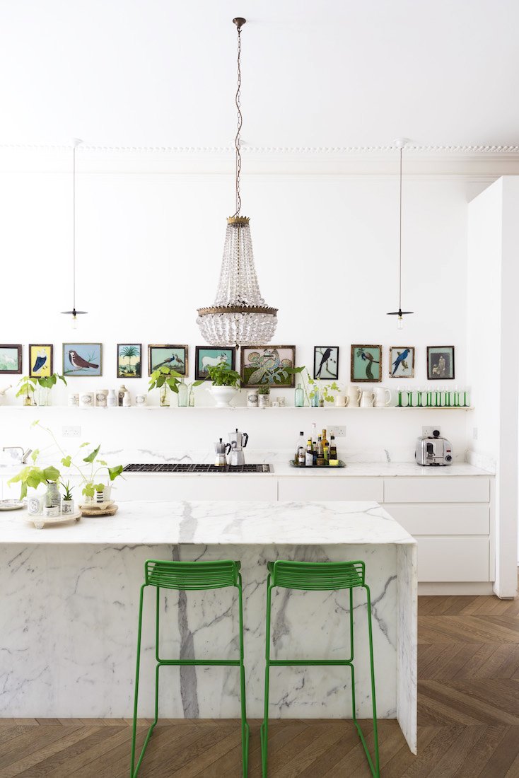
“A refreshing and revitalizing shade, Greenery is symbolic of new beginnings” reads Pantone’s announcement for their 2017 Color of the Year. Greenery is a striking shade – a bright, almost lime, green that packs much more a punch than last year’s color duo – Rose Quartz and Serenity. While last year’s colors pushed our ideas of gendered hues, this year’s color asks us for a “reconnection…with nature, ourselves, and a larger purpose”. I think the messaging behind Greenery feels very relevant and seems to be one of the most culturally significant color choices by Pantone, but when it comes to the hue itself, I tend to find that it works best in smaller doses, or when deepened to more of an emerald hue. It also seems that the name Greenery almost suggests this range, as the hue is so closely tied to the wide variety of greens found in nature’s palette. See more examples of Greenery in interiors, and some of my favorite products in the colorway after the jump.
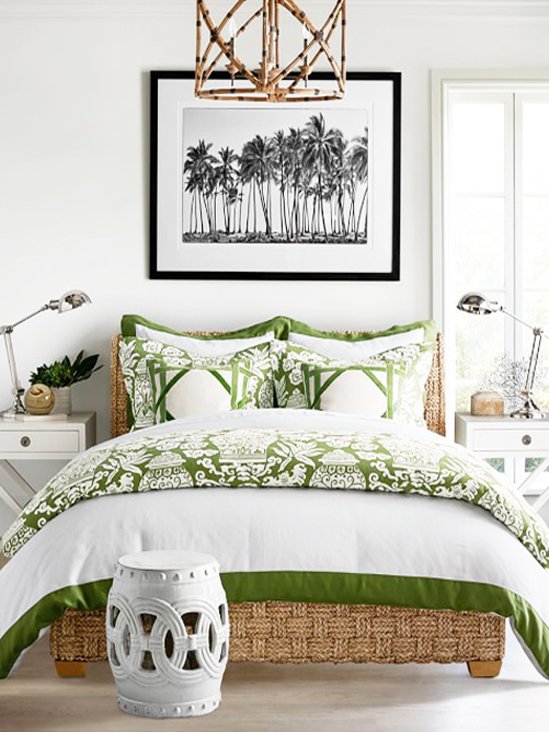 (via Linen Ginger Jar Bedding)
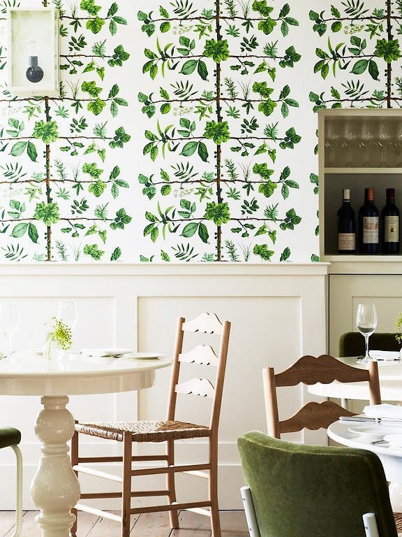 (via Stoke Place Hotel)
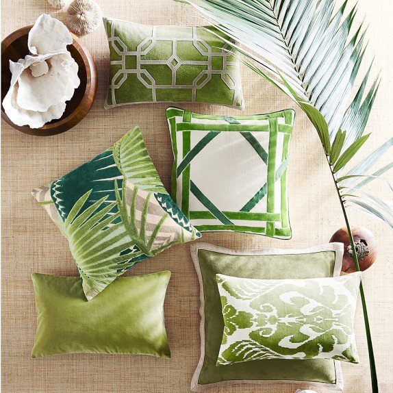 (via Velvet Applique Pillow)
 (via Thou Swell – Convertible Guest Room Design)
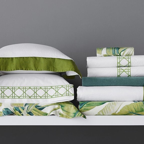 (via Cane Embroidery Bedding)
When I searched for interiors and products using this color, I found that the shade fits well with a sleek modernist style, and with a preppy chinoiserie style. Although almost opposite, both of these styles can balance such a bright hue, with predominant use of white in the modern take and with an entire palette of eye-popping hues in a more preppy style. Think: Lilly Pulitzer and the wave of Southern designers taking her color palette to interiors. On the other end of the spectrum would be something like the very first image, a kitchen in a Scandinavian home decorated in white with splashes of green throughout. I also used Greenery in my latest design project without even realizing it – the Shelby Dillon throw pillows and York wallpaper in my guest room project added a splash of bright green to the mix, which I mixed in with lots of blue, a little grey, and green plants on the other side of the room. It seems the hue works well when paired with darker shades of green as well, like on this pillow cover from Williams Sonoma. Shop my favorite picks on the market below:
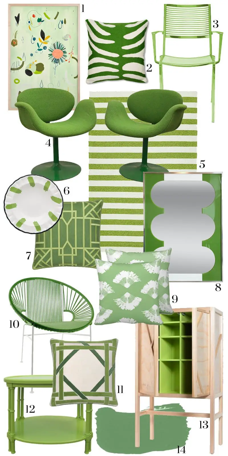
How do you feel about Pantone’s choice this year?



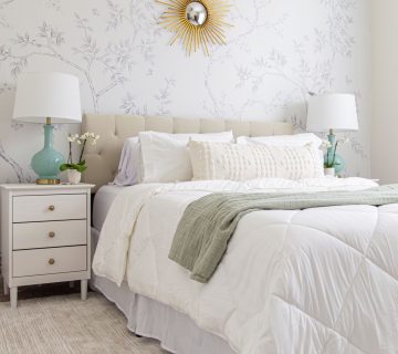
Hi Kevin, can you tell me where you sourced the beautiful black and white palm trees print over the bed in the Pantone green room?
I love your room and would love to try this when I redecorate my bedroom this year.
I live in a Queensland Australia and its sub tropical weather suits this style!
Thanks
Jenny
This is such an inspiring post! I love the blues+greens in your guestroom and those vintage tulip chairs.
Thank you so much Brenda! I love those Tulip chairs as well 🙂 Happy holidays to you and your family!!