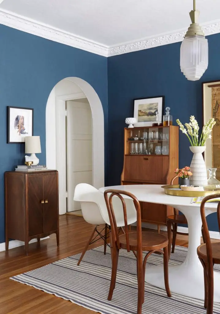
When I decorated my father’s house, we definitely spent more time and energy on his living room (it is my bedroom when I’m there, after all), and while I loved how the dining room came out, there have been several pieces I’ve been itching to replace in that space after living in it for a while. The dining table is a super interesting piece, made from reclaimed bowling alley wood on an industrial base that my dad found at Paris on Ponce, but it’s actually a bit too long for the room. It seats lots of people which has been a huge plus when my dad entertains, but it just dominates the room. I also don’t love the existing chandelier in this room and have been wanting to replace that piece for a while. Once I started imagining a sleeker chandelier, a new vision of the room started forming that was a bit more dramatic and cozy. Remember the rug and armchairs in my father’s bedroom before the spring 2016 One Room Challenge? We’re bringing those pieces back via the dining room, and balancing all that red with some deep blue walls.
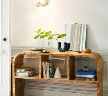
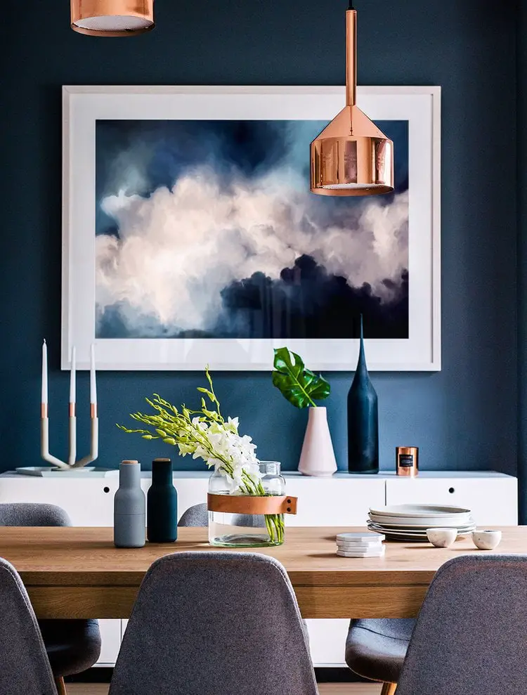 (via Adore Magazine)
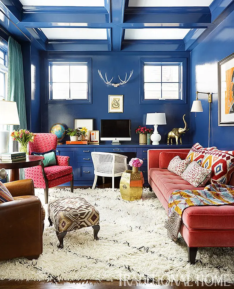 (via Traditional Home)
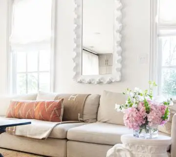
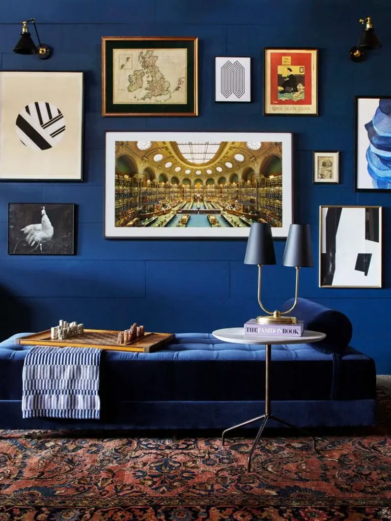 (via Emily Henderson)
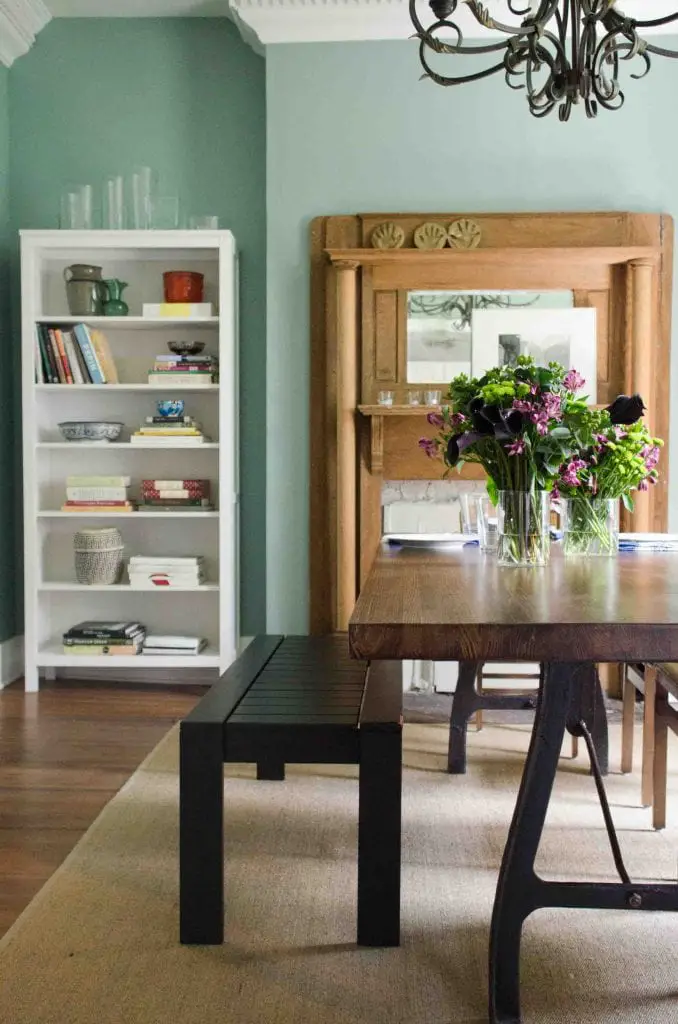
Here’s how the dining room looks now (as seen on Design*Sponge):
While the sage green has been a super serene color in this room, I’ve been wanting to give this room a dramatic facelift with a bolder design…
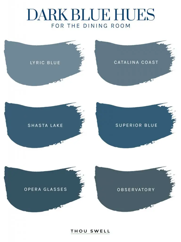
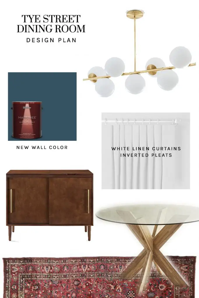
As soon as I brought these paint chips into the room I knew the first two would feel a little too faded. Observatory also felt very grey, and we already had plenty shades of grey in the living room and entry hall. Between the similar shades of Shasta Lake and Superior Blue, the latter had much more depth, but was a bit too saturated in the room, especially compared to the blue in the rug. I ended up going with Opera Glasses, because I needed a color with some green in it, although the hue is actually is much more of a true blue in person than the graphic above shows. It’s hard to view the true paint colors online, but you’ll see a better representation of the color below.
[ezcol_1half]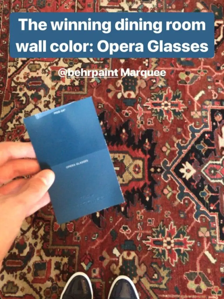
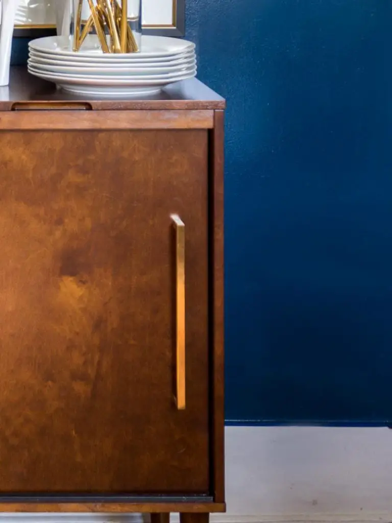
Although this shot gives a good sense of the pairing of these two elements of the room, the color is a lot richer and darker in person, and the finish is a lot shinier. See a sneak peek of the paint on the walls from a recent photoshoot below![/ezcol_1half_end]
As you’ll see below, the sleek new sideboard is a key part of the room’s redesign and I can’t wait to share more of that piece later this month. Here is the room’s design board with the key pieces I’m bringing into the space:
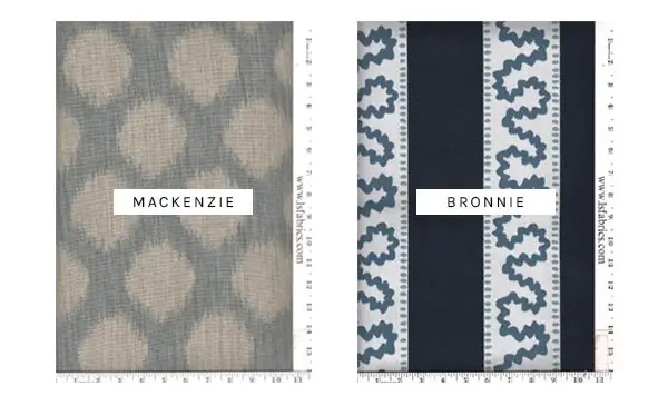
The dining chairs have presented a tricky situation for the room. The existing chairs are super cool vintage Italian folding chairs with green leather seats (which we don’t want to recover), so they will be moving to the backroom with the old dining table and we have the opportunity to bring some new chairs in. My long-term goals would be to source some vintage chairs while I’m in town and have them recovered with one of the fabrics below…
We’ll see if that part of the project actually makes it across the finish line! Feel free to chime in below with your take on the paint, fabric, and furniture selections. I’d love to hear your thoughts! Check back tomorrow for a Thanksgiving table in this room that reveals the new (old) rug and table with the old green walls.
Product for this project was provided by the following brands: AllModern, Alva, and west elm. Thank you for supporting the brands that keep Thou Swell running!


Love the inspiration photos and the idea of adding some drama to this room. Opera glasses is a wonderful choice! Looking forward to seeing the finished room. 🙂
Thanks so much! We just finished painting and I’m in love with the blue. Can’t wait to post the new design!
Your colour choices look great, and wow, does your dad have great rugs, or what? It may be overdone, but I’ve found that old brass looks great sitting on a Persian carpet, just seems to bring out all the reds. For your blue walls, I had the opposite problem recently, where I was trying to find a deep blue that didn’t have any green in it, but also wasn’t cobalt (no purple.) I found Behr Marquee’s “Secret Society,” it’s a perfect deep blue with a touch a grey to keep it from being too “anything else,” if that makes sense. Just in case you need something with no other colours in it someday. Farrow & Ball also makes a great dark blue-green called “Hague Blue,” had far too much green for my purposes, but a wonderful colour nonetheless. Also, my other go-to favourite pale blue-green-grey colour is Behr’s “Frozen Pond,” really a perfect background colour…maybe too old fashioned for a mid-century look, though? Anyway, looking forward to seeing the finished product!
Thanks so much Sarah! He definitely does have some amazing rugs – collected from when he lived in San Francisco in the 80’s. I actually did start out looking for a solid navy blue for the walls but it’s true, it’s really hard to find! Good to know about Secret Society (and a fun color name too). Can’t wait to share the room!