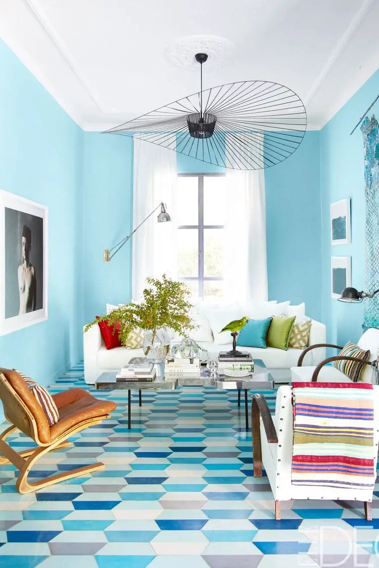
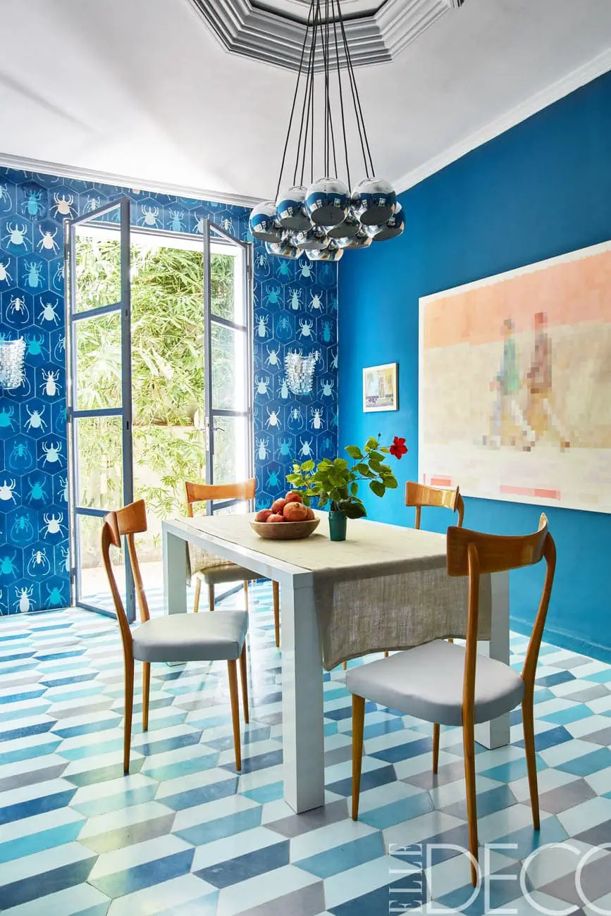
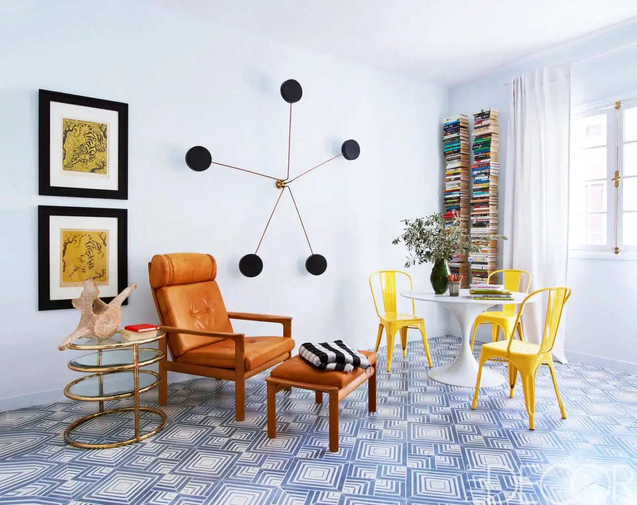
The colorful 1950’s home of Moroccan tile designers Caitlin and Samuel of Popham Design holds back no reservation with it’s explosive color combinations and bold use of pattern. It playfully showcases the design duo’s tile designs and shows how powerful a careful eye for color can be. How incredible is this dramatic entry? The couple opted for a solid banister, creating mystery in the curve of the staircase and providing more surface for a classic striped pattern to slide up the walls. And the bold blue tiled floor is in the dining room two pictures below, out-done only by cerulean walls and a beetle-print wallpaper. This home tour is buzzing with energy and anything but boring!
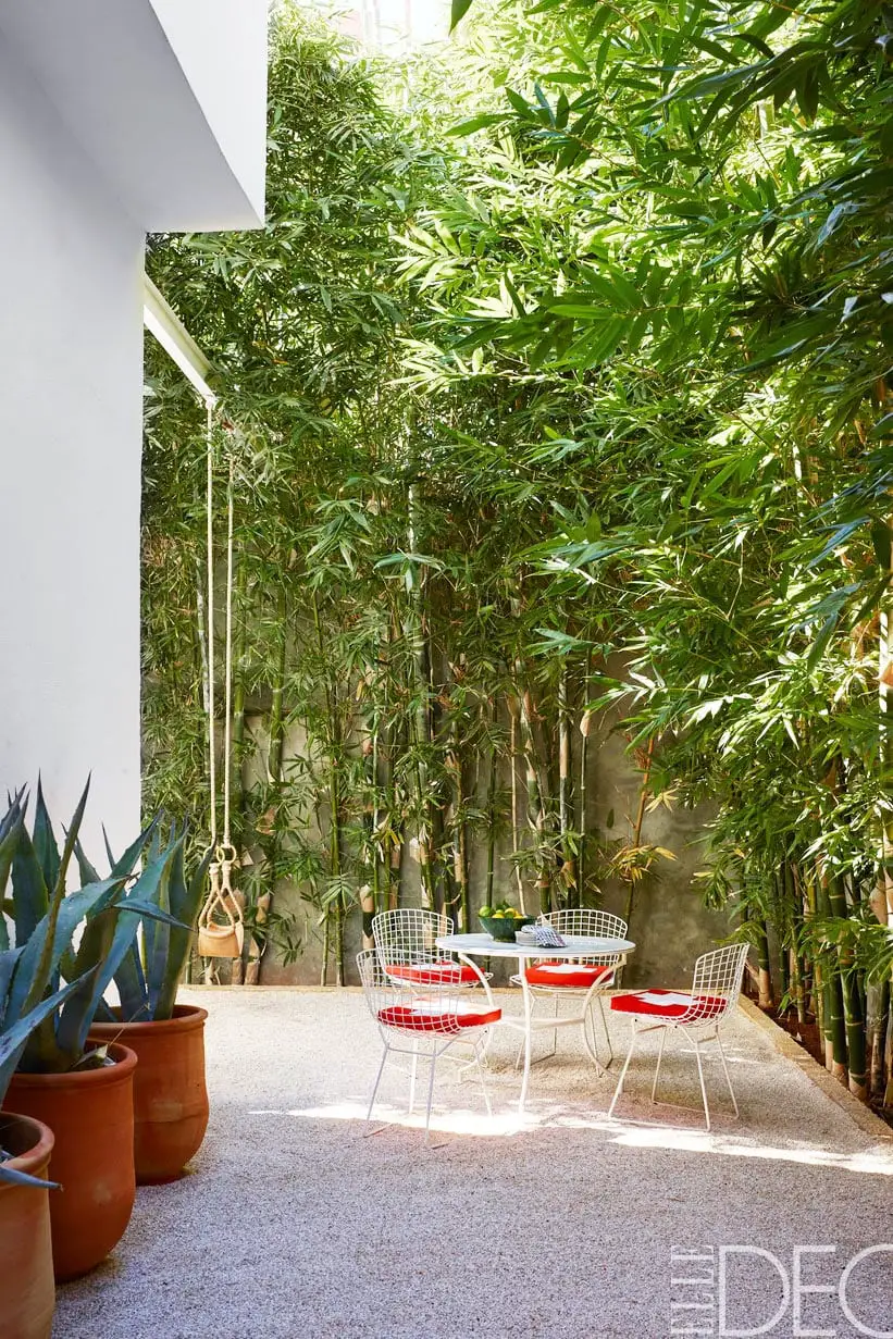
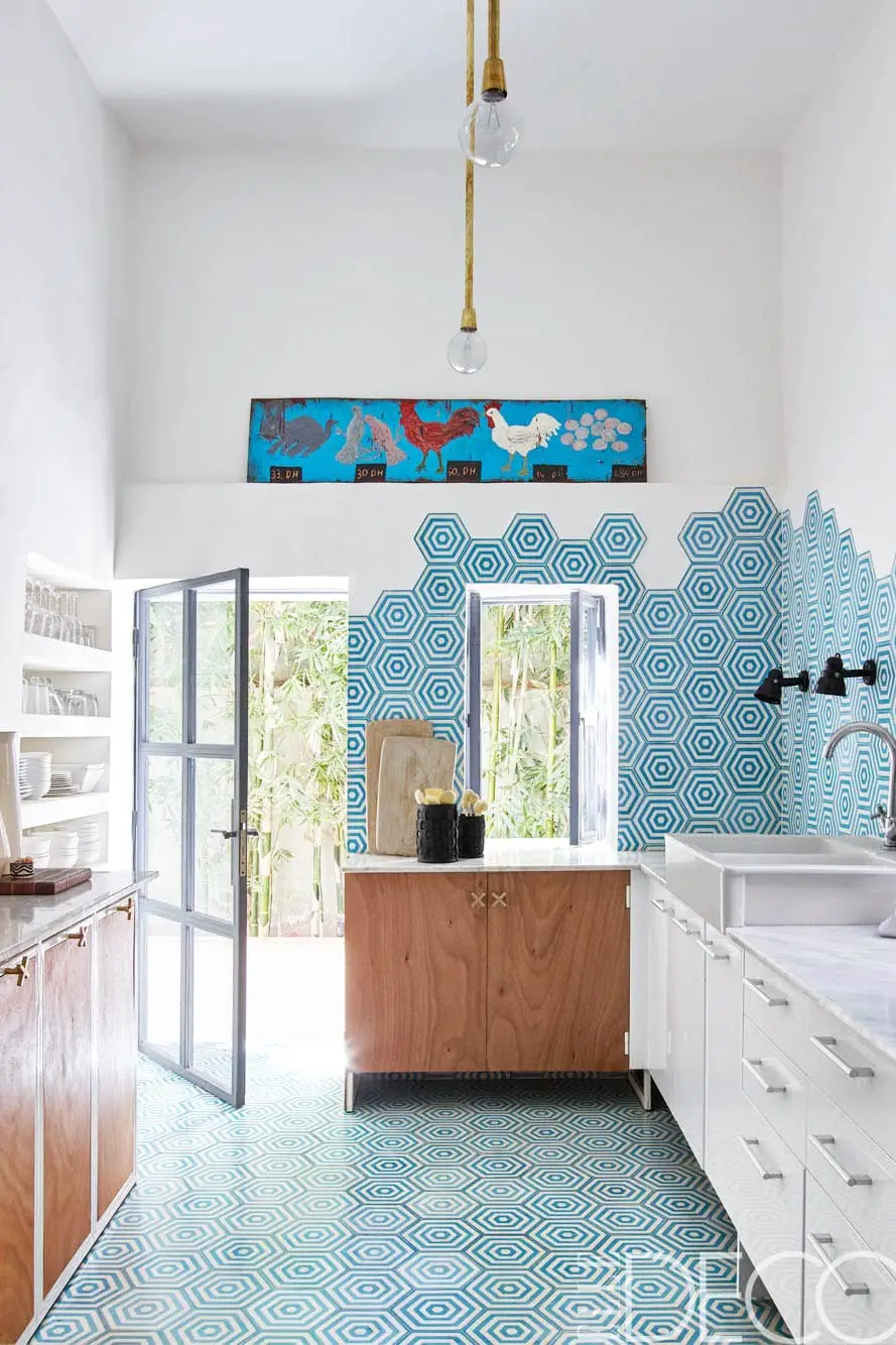
I love how the hexagonal tiles in their sparse kitchen climb from the floor to the wall creating a fun, unconventional setting. And how serene is this bamboo-lined courtyard below?
